
CASE STUDY
MGBD Parts & Services
Rescuing Shoppers with Clear Navigation & Improved Information Architecture
PROJECT OVERVIEW
This E-commerce website redesign required a strong focus on information-architecture & attention to UI detail in order to create clear paths for customers to find what they came for.
The Company
MGBD Parts and Services is an automotive website that sells new and used Rover P6 parts in the UK.
It serves a community of Rover P6 owners and enthusiasts who love these classic cars for their very British blend of sophistication and practicality.
The majority of MGBD's business is done through e-commerce with Rover owners and those servicing their vehicles.
The Problem
Website visitors found the cluttered MGBD homepage overwhelming and struggled to navigate the site.
Customers were redirected to a separate sales site that looked completely different from the main MGBD site, which created a jarring experience.
Cluttered search results and product detail pages made finding and purchasing auto parts an exercise in frustration.
The Solution
Restructure the website
Establish functional
global navigation
Implement logical product category groupings for auto parts
Improve content layout and formatting on product pages to aid scan-ability
Streamline the checkout process
PROJECT INFO
Concept Project
Key Activities
UX Research, Info Architecture, UI Design, Prototyping
Methods Used
User Interviews & Personas, Competitive & Comparative Analysis, Card Sort, Task Analysis / User Flow, Sketching, Usability Testing, Prototyping
Tools
Whiteboard, Sketch App, XD, Adobe Photoshop
Timeline
3 weeks research, design, testing
RESEARCH
HEURISTIC ANALYSIS / USER INTERVIEWS / PERSONAS / COMPETITIVE & COMPARATIVE ANALYSIS / TASK ANALYSIS / CARD SORT/ AFFINITY MAPPING / USER FLOWS
Identifying Priorities for Redesign
It was obvious that the site needed a lot of improvement, but I needed to cut through the clutter and cosmetic issues to identify specific underlying problem areas to addressing my redesign.


Where to Focus First
To do this, I conducted a Heuristic Evaluation of the site—measuring how each area met or didn’t meet usability conventions and good design principles.
I focused on the areas of the website that most impacted a customer’s experience of purchasing a car part. This included the homepage, product search functionality, and the checkout process.
Inconsistent style and cluttered content abounded, but a big part of the problem with the website was its disorganized structure and lack of consistent navigation.
Identifying Gaps
To identify other potential areas for improvement, I conducted a Competitive & Comparative Analysis. I chose other Rover P6 parts sellers for direct comparison. I also selected general auto parts websites like the AutoZone, in order to compare the specialty site to larger industry conventions.
Many sites prioritized search functionality to a much greater degree than MGBD. (MGBD specializes in a single car, so some advanced searches like search by Make, wouldn't be as important.)
Competitors also had a varying set of product categorization schemas that were all much more organized and hierarchical than MGBD’s.

Getting to Know the Customers
To address user pain points and concerns, I identified 2 primary personas who would likely be shopping on the MGBD site.

Mechanic Shop Owner, UK

Rover P6 Owner
Mechanic Shop Owner, UK
Putting Customers at the Center
I wanted to get a sense of who was shopping on MGBD’s site—their level of car knowledge, how involved they were with their car’s maintenance, where they liked to shop for car parts, and how many of them might be repeat customers. To do this, I conducted User Interviews.
To keep the websites’ customers at the center of my design process, I created User Personas based on those interview findings.
Finding the Ideal Path
By mapping the User Flow of the current site, I was able to confirm that the the actual steps in the checkout process were decent. There were only a couple steps in the process that might be consolidated.

Identifying Customer Pain Points
At this point, I wanted to refine my initial research findings and begin to reframe the website’s problems in terms of user pain points. To find those user pain points, I ran a couple usability tests, giving users scenarios to complete on the MGBD website and observing their experiences.
I distilled and composited these experiences into a customer journey map to help identify and visualize where specific problems were occurring and the kind of impact it was having on customers. This helped me focus in on redesign issues.

Key Research Takeaways
After synthesizing my research findings, I arrived at the following pain-points to address.
Navigation Is Confusing & Frustrating
Global Navigation is inconsistent and often missing entirely. The homepage is cluttered with so much content that it’s difficult to find what you’re looking for—or where to actually buy car parts.
Finding Products Is Difficult
There are so many product categories that it takes a lot of work to scan through them all. Product information is inconsistently displayed and not always where customers expect to find it.
Verifying If You've Found the Right Product Is Inefficient
Terminology, data points, and content layout of product info can hinder the customer's ability to evaluate if they've found a part that will work for their car.
Checkout Works but Is a Little Clunky
The process included extra steps and options that don’t benefit the customer trying to buy their parts.
DESIGN
SKETCHING / WIREFRAMES / PAPER PROTOTYPE / CLICKABLE PROTOTYPE
Improving Navigation
The MGBD website redesign is a case where a little information architecture goes a long way. It’s quite often the mundane things—like structure and navigation—that are most easily taken for granted yet most critical in producing a good experience for users. Fix these things and a lot of other problems go away.
Simplifying the Structure
To improve site navigation, I needed to map the existing site structure. I created a site map of the existing websites—the main site and the ecommerce site.
I consolidated the two websites into a single site with a clearer page hierarchy. This would make it easier for customers to navigate as they shopped.


Sorting Out Product Categories
I knew the MGBD site had an exhaustive list of parts/categories. I suspected it might need to be shortened, so I compared its list to those of competitors.
MGBD's parts lists was roughly twice as long as most. The list needed some overarching categories to help organized the parts—and make searches more convenient for shoppers.


Sorting Out the Categories
I consolidated the list of parts, aiming to cut the list in half, at least. I also wanted to keep the terminology as clear and intuitive as possible.
I used an open card sort with a user to compare their car part associations with my new category list.
Then I set up a simple paper prototype to test if users could navigate a new menu system based on the reorganized parts category list.
Visualizing the Flow
After developing the site's basic navigation, I created a wire flow of the site, focused on buying a car part.
This helped me visualize what screens I was going to need to create and the general flow between them.

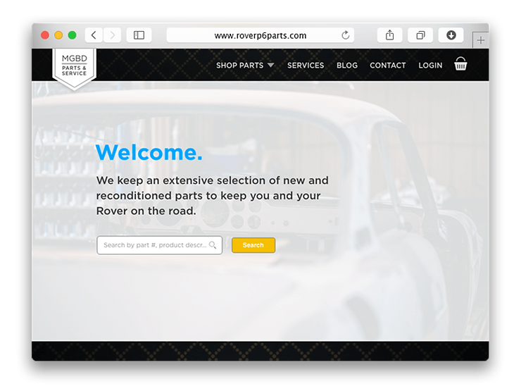
Cleaning Up the Homepage
With the structure and navigation sorted out, I turned to the home page to create a good first impression. I wanted visitors to know what they could do on the site and where to get started.

Clearing the Clutter
I began the home page redesign by stripping the content down to what was essential to the customer’s main goal of finding and purchasing car parts.
Most extra content were simply photos, not even clickable. Because there was so much content on the home page, I starting over with a few essentials in order to refocus the design:
-
A clear header section
-
Login / Shopping cart
-
Global navigation
-
Search function
-
Basic promotional area
-
Footer
Homepage concepts

Homepage wireframe


More Prominent Search
User tests indicated that people often didn’t see the search field on the home page. To help search-dominant visitors, I moved the search function to a featured section at the top of the body of the home page.
I adding an autocomplete function to make the search function more convenient.
Cleaning Up the Product Category Pages
Users were bouncing back and forth between the listing and details pages when info was “hidden” at a deeper layer or was not where they would expect it. Customers needed the right information to be where they expected it to be, when they needed it.
Making Product Info Scan-able
To get the balance of information between the pages right, I redesigned the presentation of the information around their two respective purposes—scanning through listings and digging into the details. Any information on listings pages that was not immediately relevant to customers quickly assessing if that was the part they wanted was moved “deeper” into its product details page.


Item Added to Cart
Based on user feedback, I added a modal to confirm that an item had been successfully added to their basket.
The old site didn't include any system feedback to confirm that the customer's item had been successfully added to the basket.
Requesting Notification
I made the request notification option more prominent by adding copy that makes customers aware of this option, and utilizing a button state change.
(I also changed the request notification modal so that if you’re logged in, you don’t have to provide your email; you only need to hit an “activate notification” button.)
Explaining Jargon in Context
Based on usability test feedback, I added info icons to product information like “reconditioned part” that might require further explanation.
The information existed on the site but was on a separate page. The info could be a lot more valuable inline, right where the customer could access it, when they needed it.
Indicating Limited Stock
Based on feedback from a task analysis, I added an additional feature to the “In-stock” category. Where a product was In-stock but low on inventory (e.g. 5 or less items), the site would now display exactly how many were left.
On the existing site, customers would find out after they tried to order 6 bolts that there weren’t 6 in stock. They were left guessing how many were in stock i.e. how many they could order.
Their only choice was to edit their order again and again until they discovered by trial and error the quantity actually available.


Streamlining the Checkout Process
The checkout process was generally straight-forward and functional. I mostly cleaned up the UI. I also combined the shipping info and delivery method pages, and removed half of the form fields from the shipping page, which were optional.


RETROSPECTIVE
Key Lessons / Things to Improve / Going Further
Key Lessons
Task analysis was one of the most useful tools for helping me pick up on very specific problems users ran into. Many of these directly translated to UI fixes and improvements.
Things to Improve
I would further explore cases where searches turned up potentially hundreds of items and how to sort those
Going Further
I would like to explore more of the visual navigation feature, one that lets users find parts through interacting with a see-through car and its sub systems.
I realize this feature would probably be a feasibility challenge.